(CHALLENGE)
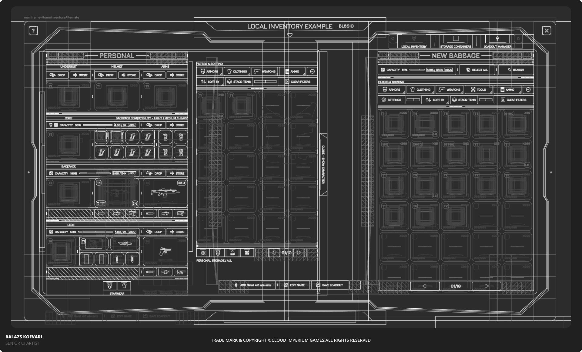
The challenge of designing interfaces for a game like Star Citizen lies in the complexity of its systems and its distinctive visual language. In this exploration, I aimed to preserve the game’s signature holographic, parallax-driven aesthetic while giving players a clearer and more intuitive inventory structure. Clearly labeled action buttons improve usability and reduce the need to rely solely on icons. The new structure also helps players understand the hierarchy between their gear and the various sub-inventory systems.